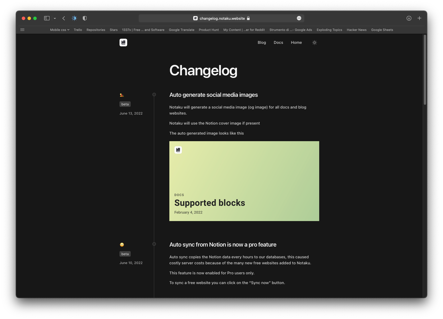
This is a list of awesome changelog websites i collected while building the changelog websites feature for Notaku.
If you want to create one, please consider trying Notaku, it turns your Notion pages into docs/blog/changelog websites like this one.
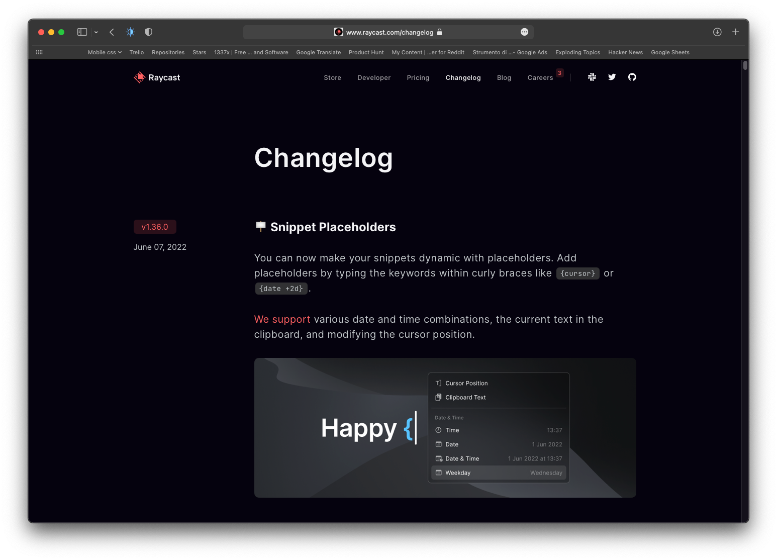
Raycast has a nice design with sticky version numbers badges on the left and the conten on right.
Images are rounded with a soft shadow.
Emojis on titles make everything more fun.
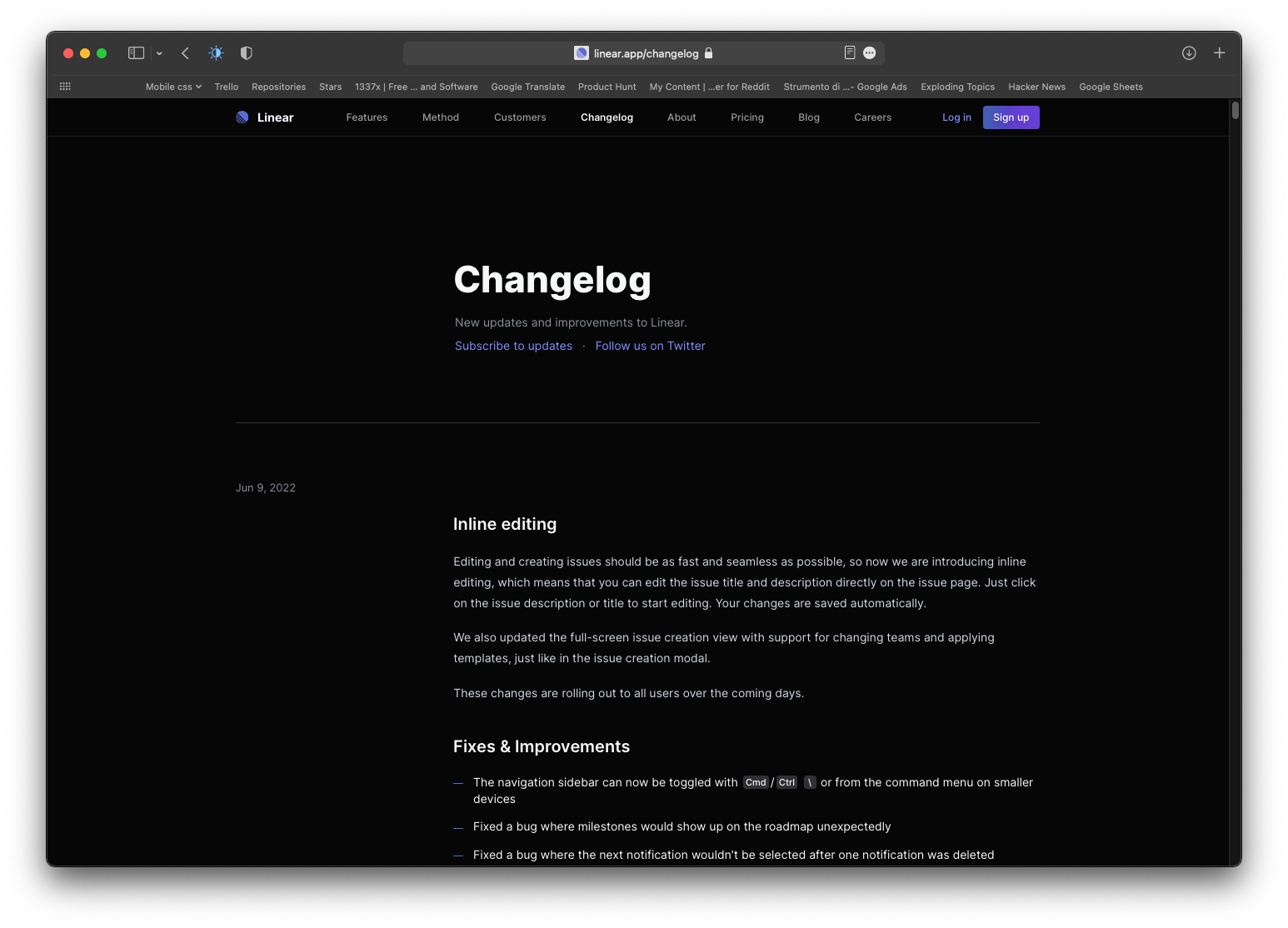
Another awesome design white on black from the Linear website.
Very good use of linear primary color on navbar, buttons, subtitles and content.
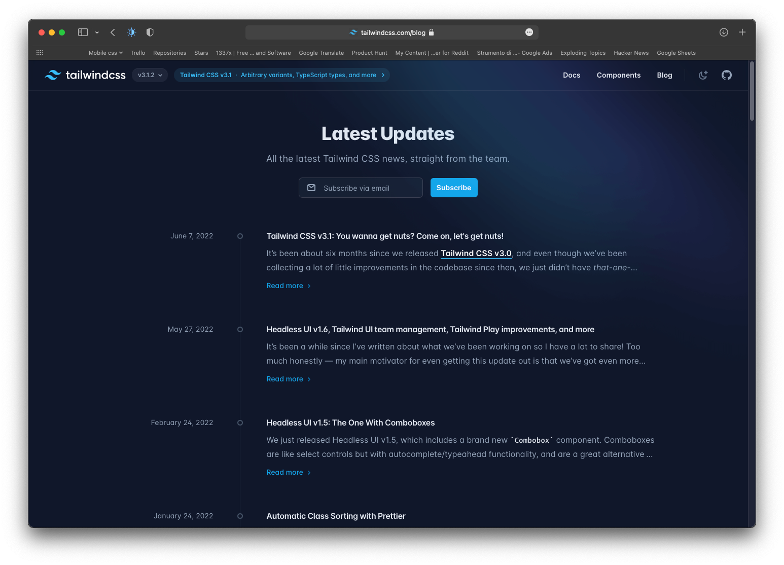
This is not really a changelog website and more a blog but most of the times they post about tailwind updates anyway so i included it here.
I love the line and circles on the left, it adds some personality.
Typical design with the sticky date on the left and text on the right.
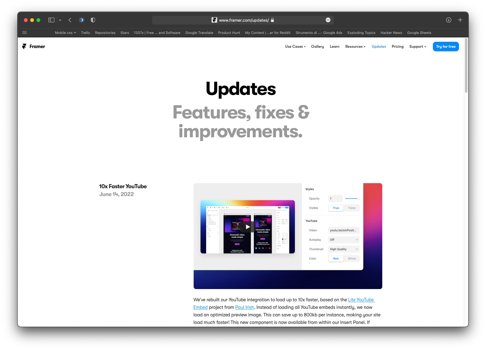
Notaku changelog takes inspiration from all other websites in this list.
The left side includes emojis, version badges and dates that stick to the top of the browser window.
It uses the same tailwind line decoration on the left to add some style.
The best part is that Notaku is a tool to creates websites like this, even this blog websites has been built with Notaku.
Notaku takes content from Notion pages and publishes them as docs/blog/changelog website on the web.
